What company wouldn’t want to facilitate their customer’s ability to self-serve? Most customers want to be able to help themselves but might not have the know-how. You could have the best self-service resources available, but it’s not very useful if your customers (or your employees) don’t have knowledge of where to find it. From SMBs to enterprise companies, finding ways to make knowledge more accessible can be a huge strategic advantage for your organization. As they say on Top Chef, plating and presentation is everything.
Design and user experience aren’t just buzzwords—they are assets when it comes to serving your customers knowledge. The way your customers interact with your brand resources is an impression of your company and the service you provide. If navigating your site is a frustrating process, your customers are going to feel frustrated with your brand. People like smart, clean organization that’s easy to navigate, so plate your knowledge as cleanly as beautifully as possible, and serve up some knowledge management.
Estos son tres de nuestros ejemplos favoritos de gestión del conocimiento, y quizás del tipo de base de conocimientos que tu empresa querrá desarrollar:
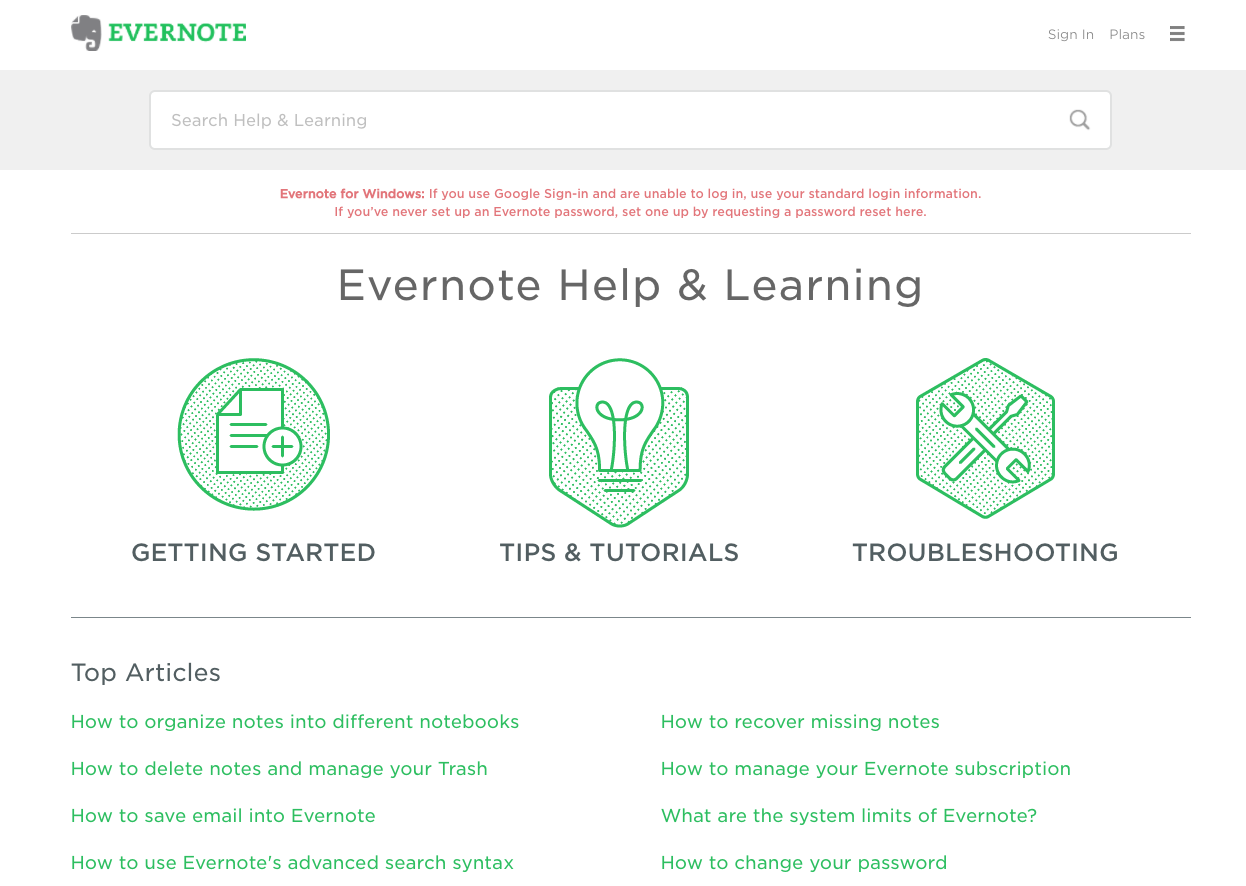
1. Evernote
Evernote made our top knowledge management list because of their simple organizational beauty. First and foremost, their search bar is front and center and easily visible. Customers want an easy process to search for specific issues, rather than combing through a maze of endless resources. Evernote’s help center also has a list of top articles, as well as a clearly marked way to get more help from other resources if needed.


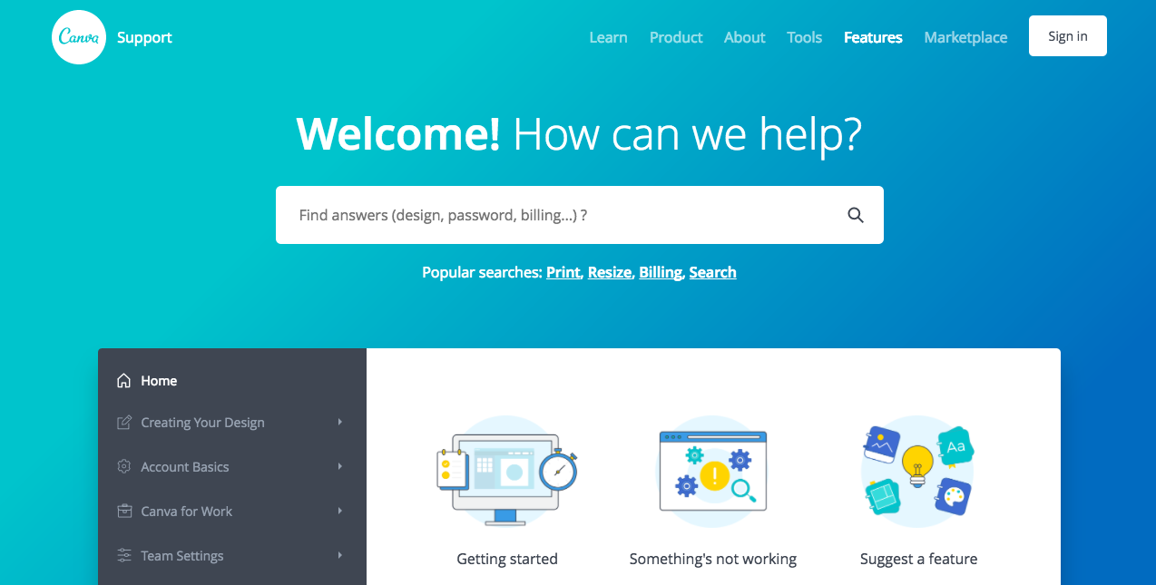
2. Canva
Canva’s knowledge management makes it easy to access the basic insights on getting started, or when something isn’t working. However, they also offer something unique—forstering innovation by allowing customers to suggest features. Canva understands that customer interactions with their product and website is one of their biggest success factors. They’re a wealth of information when it comes to what Canva can develop and improve on.
Dar voz a los clientes supone para Canva una valiosa oportunidad para aprender de ellos y mejorar su proceso comercial en general. Y no solo eso, ya que la gestión del conocimiento de Canva incluye una completa barra lateral de información con títulos sencillos y métodos de organización bien diseñados, centrados en la creación de diseños, conceptos básicos de las cuentas y el uso de Canva para el trabajo.

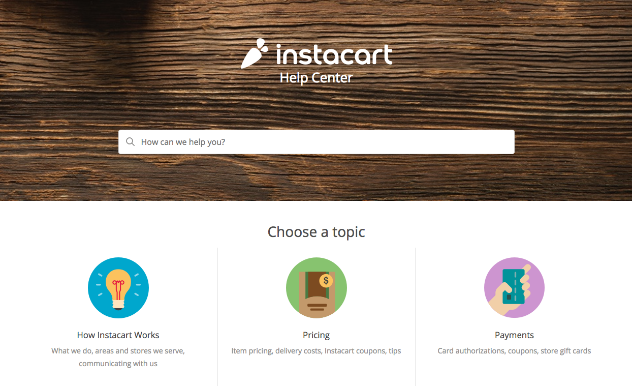
3. Instacart
Instacart’s process of knowledge management is utterly simple to implement, even for those who aren’t savvy with technology. They host a prominent search bar and clean graphics on common customer questions, such as how Instacart works, how much it costs, and the ins and outs of ordering, and and new products available. Instacart’s help center consists of crisp knowledge organization and clean content categories, making it an easy process for self-sufficient customers to find answers.

La presentación es clave
All three knowledge management examples have a few knowledge base design best practices in common. Implementation of an easily accessible search bar, short and simple article titles, and a clear process to get more help if needed give these companies an organizational advantage. They’re worthwhile practices to follow—allowing customers to self-servethrough technology lets companies reap the rewards. Gartner reports that organizations with proper knowledge management systems in place can reduce overall support costs by 25 percent. What’s more, 94% of Zendesk Guide users reduced support costs by 50% or more.
Navegar por un sitio web desconocido tiene sus complicaciones, pero presentar la gestión del conocimiento de una manera sencilla y atractiva puede facilitar la vida a tus clientes (y empleados), especialmente si ya están buscando ayuda. Un Centro de ayuda lioso es solo otro obstáculo para que un cliente encuentre respuestas, así que ya sabes: sencillez ante todo.
